
A brave promise and brave branding
squeezed out of a moderate budget.
A brave promise and brave branding squeezed out of a moderate budget.
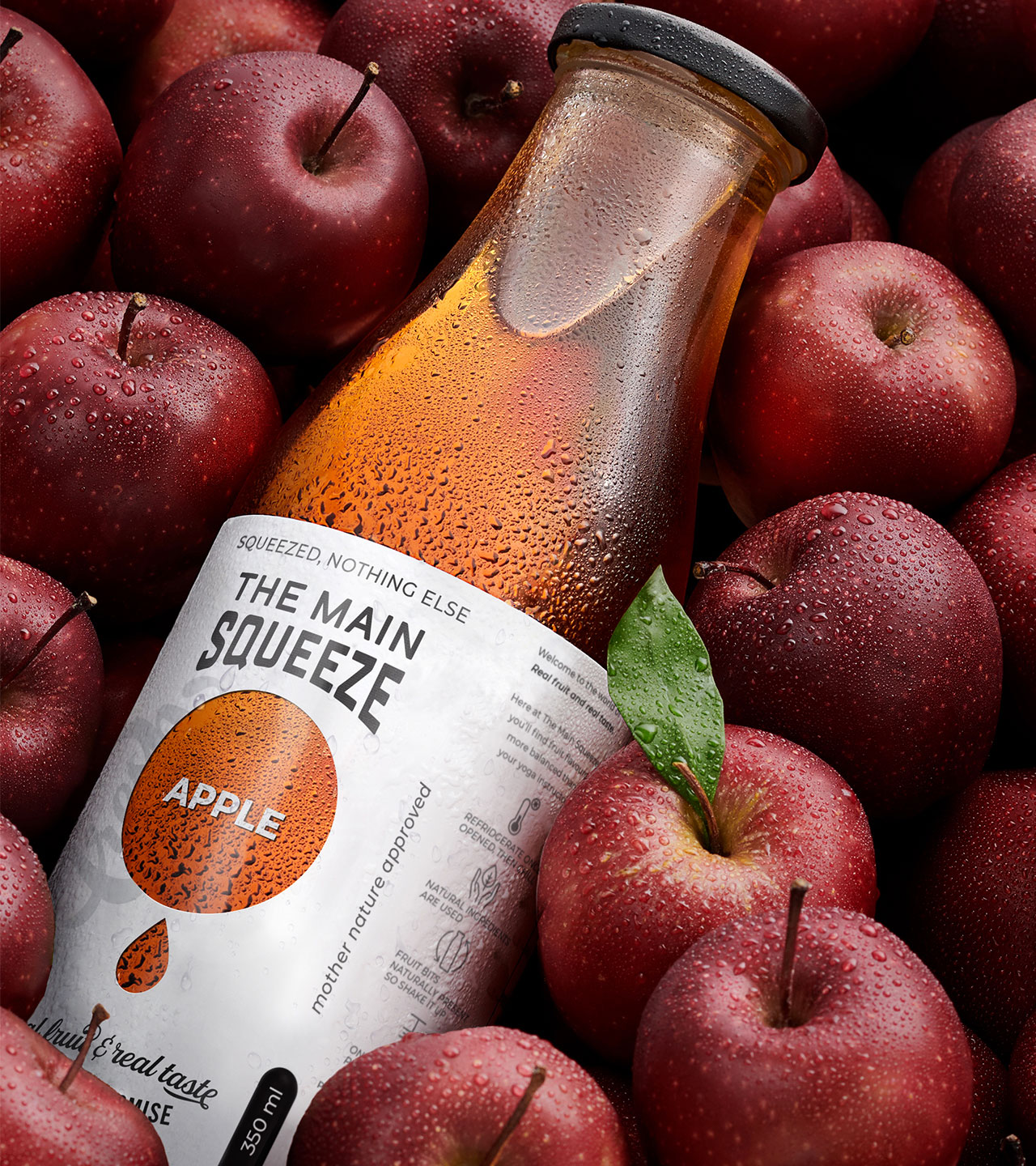
From the beginning, our brand creation had a brave yet simple vision, ’Squeezed, nothing else’
THE MAIN SQUEEZE was born out of a desire to return to simpler times before additives and E-numbers, THE MAIN SQUEEZE committed itself to taste, freshness and nothing else. The challenge was a small startup budget with a need to package a broad range of flavours.
The solution? Let the natural goodness of the juice shine through, literally through the label. A simple black and white label saved on costs without losing taste appeal. The solution underlined the promise of freshness by allowing the contents to speak with colour. The die cut hole was applied to business cards allowing us to perpetuate the fun element and reinforced the brand.
A healthy solution all round!
___
Scope: Brand Strategy, Packaging Design, Brand Identity, Brand World.


